Your online shop has the same effect as the Bermuda Triangle on a day-to-day basis. Many users get there... and you never hear from them again. Not a single purchase, not a single form completed, not even any materials downloaded.
Where did everyone go?
Luckily, the reason is not as mysterious as in a program on alien encounters. It’s simply that your customers arrived to the wrong place of your website and they went away after not finding anything of interest to them.
What is a landing page?
A landing page is a page of a website used to attract leads and connect the site to marketing actions, such as pay-per-click ads, promotions on social networks, links on emails, etc. Landing pages are also a good resource to attract organic traffic through keyword strategies that enhance search engine positioning.
Many online shops make an enormous marketing effort in terms of drafting ad campaigns, doing mailing lists, and retargeting; however, the key in those materials is to guide the user to the right page.
In many cases, companies and brands trust that redirecting any user to the website’s homepage is enough. And, nevertheless, the homepage should never substitute a landing page’s purpose, nor should it fulfill the same goals.
Landing pages are pages where a response to an action is given: an invitation to discover a new product or collection, access a tutorial or informational resource, or see the conditions of a discount.
The contents of a landing page are direct, align with a specific audience, and meet a specific goal. That’s why there are no two landing pages that are alike, nor is there a sole formula for designing a landing page. And, for that same reason, your homepage won’t do for converting leads, as your homepage is your general cover letter.
→ You may be interested in: How to create quality content that is valued by Google
Why is it important to include landing pages on your website?
According to Hubspot, the conversion rate for visits to a website is between 1% and 3%, while landing pages have a conversion rate for total traffic of between 5% and 15%.
This is an important reason to start worrying more about creating landing pages that fit with your business.
What’s more, one of the most frequent complaints of online customers is the absence of service and accurate answers. It’s hard for them to find the right product information or understand the conditions of a promotion or how to register to access certain advantages.
→ Related: How to make your products stand out in Google Shopping
Why don’t your Google Ads or newsletter with that important announcement yield the results you’re after?
Because those strategies that have been so well designed don’t lead to anywhere. Or, we should say, they lead to the same page as always. What does this sound like to you? You guessed it: clickbait.
That’s why a website’s homepage will NEVER be the ideal landing page. Just as the ideal landing page is not identical in all ecommerce sectors, nor is it the same for all products and services.
When clicking on an advertisement link or email, the potential customer will get frustrated if he or she ends up at the homepage of a website or a section where there is too much information. To get that customer interested in your brand, you have to put him or her into a small reception hall first.
Uses of landing pages in ecommerce
A landing page in ecommerce is mainly used to speed up the customers’ purchase process. The intermediate steps that make it harder for a user to get to know about a product or service are bypassed, and it’s a great way to get to know a catalog or brand.
Landing page design is geared towards the user walking down a yellow brick road: easy and attractive. It’s a page that effectively meets its aim: the customer will find the information that he or she is looking for and the action that should be taken. A CTA, a subscription form, a purchase button, or any other sequence that is both intuitive and easy.
→ Take note of them all: Keys and trends in online shop design
Because of all that, landing pages are very useful resources in promotional campaigns. They are the pages that will be shown to the user when he or she follows the link of an ad or in an email — and they go straight to the point.
The use of landing pages also reduces the bounce rate for the website as these pages have been specially created to answer a question or clear up a specific doubt.
What’s more, specific content in which words are well cultivated helps you get on Google’s good side as opposed to similar websites that limit themselves to redirecting users to their homepage or main category pages. Remember that the more quality content you have and the greater quality score you are assigned, the lower the cost per click will be and the less your campaign will cost.
The product page as a landing page in ecommerce
If you want to use product pages as landing pages for certain campaigns in which you want to highlight products from your catalog, the key will be properly managing your product information. The following must be well defined:
- Descriptive elements, with all optimal keywords
- The answers to the most commonly asked questions for that product
- A photo gallery
- Videos to demonstrate the product
- Reviews or testimonials
A Product Information Management (PIM) system is the piece of software that is most relied on by marketers to keep all product data up to date on all ecommerce channels, guarantee that the contents are unique and complete, and favor online positioning.
The boldest businesses use ecommerce landing pages to redirect the customer to the shopping cart of the online shop, with the product added and ready to be purchased. This more aggressive strategy is useful if the landing page aims to reinforce a promotion or special benefits that expire on a specific date — something that lends itself to an immediate purchase: hurry up, they’re flying off the shelf, get yours while it’s hot, join the rest of satisfied customers now.
→ A success story: How IKEA improved its sales with better product information
Examples of landing pages from Google Ads
Let’s take a look at example landing pages in a search made on Google for flamingo pool floats and the results from sponsored links.
Firstly, Urban Outfitters appears, yielding a general category page — although flamingo pool floats are amongst the first options. This type of presentation is not the most recommended, but it can be used as a strategy in case the user decides to change his or her mind and pick another model instead of the one shown in the ad.
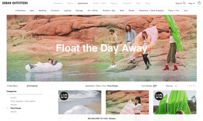
This option is a bit of a double-edged sword because, depending on the type of customer, he or she may feel overwhelmed or encouraged by suddenly seeing a wide range of possibilities.
Amazon offers a more specific result with a link to a specific product page, as we were talking about before. This strategy is more effective with customers who are in a hurry and don’t need to compare different models and prices.
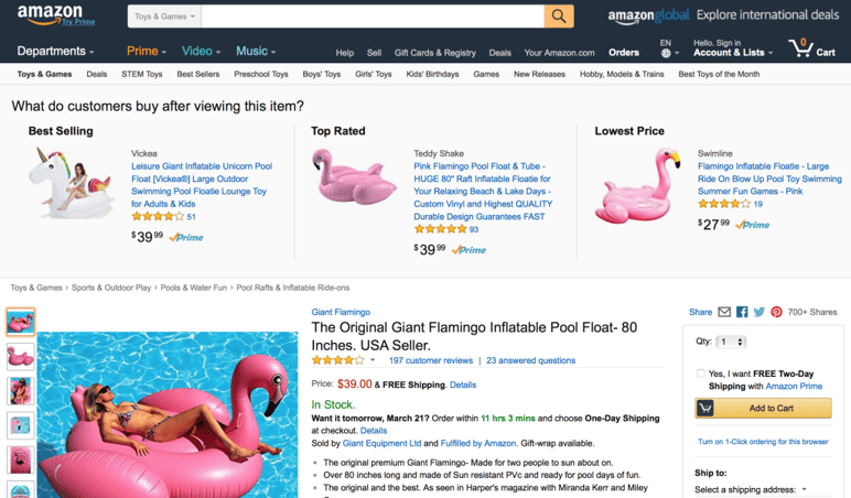
Another Amazon link directs users to the small flamingo pool floats for drinks subcategory, which is a much more specific result that is probably not the right one for the majority of users who haven’t used the keywords drink or small in their search.
Toy Splash also takes users to a general list and, at first sight, the flamingo pool float is not included. The user has to search through the category, and the special price that was the additional hook also has not been highlighted.
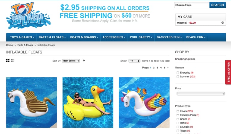
Even if these first views don’t result in conversions, retargeting will allow you to keep showing users ads related to prior searches.
→ More tips: The mistakes you should avoid when creating apps for ecommerce
How to make a landing page to get more conversions
As we were saying before, there is not a “cookie-cutter” formula for a landing page.
Your instruction manual will depend on the objective of the page; a landing page that aims to inform on the temporary promotion of a product is not the same as one that shows an educational tutorial about how to use the product.
Generally speaking, when designing a landing page you should take into account the following:
- The audience type
- The aim of the page
- The product niche and sector
- The tone of the message
- The brand perception
- The necessary support resources
A recognizable brand style
While it is not necessary to keep up with a style that is 100% identical between your website and marketing materials, it is important for there to be coherence.
There should be a visual transition between the ad, email, or newsletter and the page where the user ends up: the same appearance and resources in terms of colors, fonts, and types of images used. And, of course, never forget to include and highlight your brand’s logo.
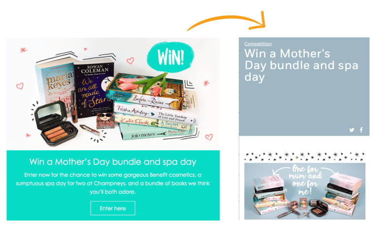
In this example from the English publishing company Penguin books, the appearances of the ad and the landing page are subtly different for a Mother’s Day campaign. Despite that, both share a style pattern and the same key information is highlighted about the advertised contest.
Simple design
A landing page should not be overloaded with elements; instead, it should lead directly to the aim of the ad, which is also the aim of your customer.
Don’t make users waste their time: give them benefits and advantages and use a positive language that calls for action with short texts that provide key information instantly.
In the design of a landing page, navigation is simplified and just a few elements are enough:
- Title and subtitle
- Concise explanatory or descriptive text
- Images or a video
- Testimonials, logos, or any other resource that gives the page authority
- Quality seal to build trust in your website’s security
For landing pages, it is advisable to remove the typical website navigation elements like side menus, categories, and drop down boxes so as to not distract away from users’ view and to focus on the campaign’s main elements. Having said that, keep the information on the fact that payments are secure, technical service, and contact information, as well as awards and joint efforts with other brands if they exist.
Remember that in ecommerce design, less is always more (except for the richness of product information that should be included on the product pages).
→ Take note: Microinteractions that should be included in your designs
Coherent structure
A landing page is created to give an exact response to a customer at the exact time he or she does his search, and to make it clear to that customer what he or she should do next.
Therefore, it is very important for the relationship between links and landing pages to be coherent. Clicking on a link in an email to download a success story only to have the link lead the user to a general page with resources is not the right strategy.
Even though landing pages are ‘ghost’ URLs in the sense that they are not normally part of the main menu of your website, they have a purpose that aligns with everything else. If the user thinks that he or she has arrived to the wrong landing page because there isn’t much of a relationship between the original materials and that page, he or she will go away.
Another key is that the landing page must include the same information or promise as in the ad. This is important when promoting discounts or sales during specific seasons, like what Zara does in its newsletters.
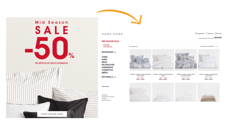
This requirement is also key when talking about photographs. The images that you put in your promotional materials must include products from your catalog. If those products cannot later be found on your landing page or the rest of your website, users will feel frustrated and you may lose new customers.
Call to action
A call to action (or ‘CTA’) is the central focus and the king of the landing page.
In normal web surfing, the buyer needs to look for where certain actions are undertaken. In a landing page, the action must be highlighted in such a clear way that only two seconds are necessary for the user to know what to do: how to buy something, register, or apply a discount.
Use colors that draw attention in strategic places and buttons, remembering that this will also help them to be identified at first glance on small screens like those of smartphones.
Seasonal promotions or advertisements for specific products usually use the CTA to drive conversion; however, for more complex services a landing page with extra explanations will be necessary before making the call to action.
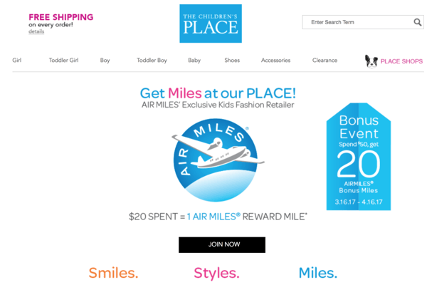
Lastly, don’t forget to include buttons in the landing page to share the page on social networks as this can get users to attract similar audiences.
Additional resources
A landing page has to go beyond a simple form and ‘buy now’ button. Explaining the advantages and benefits is first and foremost before convincing the buyer and, to accomplish that, resources like guides, free demos, videos, and personalized consultations usually work quite well.
If you include that type of resource and want to attach them to a form, make it more simple to fill out than in other parts of your website.
Likewise, if it is necessary to have a process with several steps that starts out on a landing page, include a prior summary of the steps so that it seems simpler. This helps to do away with a reluctance to a steps-based purchasing process and it lets users know how long the purchase process or query is going to take.
→ Don’t miss it: 10 key tools for your ecommerce strategy
Conclusion
We hope that you have not only seen the advantages of using a single landing page but of using many! Creating landing pages for campaigns and deals will make your content more specific and improve quality traffic and conversions.
Landing pages are a work in continuous progress, as these are short-lived resources that will need to be adapted to each new campaign and target.
Analyze the results of your landing pages to check the effectiveness of the links and the CTAs, as well as that of the channels on which your linked advertisements are shown and the effectiveness of the time when emails and newsletters are sent.
And to fully optimize your work and use product pages with a high conversion rate like landing pages, try a free, 30-day demo of Sales Layer’s PIM solution. Get the best landing page for online customers by creating quality ecommerce content.


