
Open.
Search.
Add to basket.
Pay.
Simple, right?
Although the Internet has made it easier to search for products, brands and points of sale, the truth is that the time devoted to this process has been reduced significantly.
Being able to locate a product or service in a mobile app either on or offline is the fastest route for consumers and forms a platform for companies to grow.
Now, the boom in apps and m-commerce (mobile commerce) meant many examples were built quickly, and as a result, badly. Without taking enough care of the quality of the content and the design, brands launched mobile apps to get onto Play Store and the App Store as fast as they could.
The result?
Hundreds of negative reviews from consumers complaining about clunky, slow online store apps, with incomplete catalogs, pixelated images, a lack of data and so on.
And it's not just your neighborhood store: even large companies like IKEA have had to retrace their steps and learn a lot until they felt able offer a good enough e-commerce experience on mobile.
Let’s help you identify and avoid the 10 most common errors in designing apps for e-commerce:
- Overly long onboarding
- Too many functions
- Scarcity of product information
- Limited product images
- Confusing navigation
- Lack of personalization
- Obligatory account sign up
- Elongated payment processes
- Omnichannel disconnects
- Pop-ups
Overly long onboarding
Customize the user experience, or get started quick?
Automate your users’ location or leave it for them to choose (geolocation blockers come into play here)?
Everything has its pros and cons, but the key is to favor user choice, and make it as easy as possible.
For example, include country and language selection on the first screen which appears each time the user opens the app and remember the first selection on the first visit.
Then, the app should redirect to a main panel or homescreen where it’s easy to identify the menus. It’s also effective to include a carousel with images or GIFs that highlight different categories, new releases, promotions or events. However, the user should never be forced to see those elements before they can access the menu or search bar, nor should they be camouflaged in the design.
Too many functions
Dropdown catalog categories (without a ton of subcategories). Search field of key terms. User account area. Shopping basket.
They are only four icons, which are usually universal: three horizontal bars, a magnifying glass, a user icon, and a shopping cart.
Simplicity is king in the design of apps for e-commerce; because of the screen size, users need to easily identify what they are looking for.
Being simple does not mean being a simpleton. It is always better to start with the essentials and expand as necessary, instead of building a complex app and then having to remove the redundant functions (multiple wish lists, custom product galleries, environment simulators or styles, related blog or video content, etc).
Scarcity of product information
The buyer wants to search quickly, but not make decisions lightly.
Given the limited space on a mobile screen, many businesses believe that the amount of information provided should be reduced.
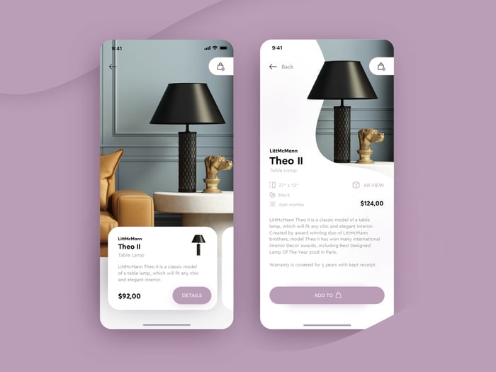
Product pages in an e-commerce app must be as relevant and comprehensive as in any other channel. The design is what makes the difference: it highlights the descriptions and the key data according to the type of product (dimensions in a piece of furniture, fabrics in a garment, size in a DIY tool), and leaves the most complete information reserved for a drop-down
The amount of product information determines the success and growth in conversions from e-commerce apps. Product data management tools as a PIM system are an essential complement to connect the correct product information with an app and keep it updated with the other channels and marketplaces.
Limited product images
To avoid problems with loading time, many brands choose to reduce the number of images of their products in the app.
Big mistake.
The clean design and white backgrounds recommended for any e-commerce app are there to service the images which are fundamental to conversion.
The photographs will determine if a buyer adds a product to the basket or not: the images must adapt to the vertical and horizontal format of mobile screens, allow for zooming in (essential on small screens), and also combine images (with products in model, scene or with examples of the product being used) with product portraits on a white background and in different angles.
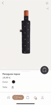
But maybe not all products need so many images. As the Oysho app exemplifies, the product page of a pair of scrunchies is limited to four images, while a folding umbrella includes more pics to show all its functions.

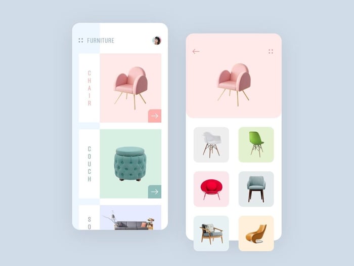
Confusing navigation
An app is not used in the same way as a webpage.
You can start with a clear and logical map for any type of industry and buyer, but it is advisable to use analysis tools that identify in which areas of the screen most users of the app stop, which zones or buttons they click, and what steps are taken.
This data will allow you to refine the navigation within the app, highlighting the categories you should be highlighting, what elements you have to prioritize on the screen and which is the fastest way to get from the product to the shopping cart.
→ Don't miss these 10 microinteractions for an improved app design!
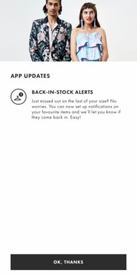
Lack of personalization
What’s the secret to getting users’ attention on a tiny smartphone screen?
Microinteractions are elements of web and app design that show a message or action visually. It is important to customize ecommerce apps with clear and striking interactions that draw attention. For example, when adding a product to the shopping cart, or when moving on into the purchase process or finalizing a payment.
Another element that is very easy to customize and that buyers usually appreciate is a keyboard integrated in the app, alphanumeric or numeric. You can incorporate structured data that makes it easier to type data or passwords, with larger keys for numerical fields and pre-filled email addresses where necessary.
Obligatory account sign up
One of the main reasons a consumer doesn’t make a purchase in an app is having to create an account before buying.
But this step is very useful for brands, as buyer data and e-mail are obtained as a result. But on mobile the user usually acts faster than in purchases from other devices such as computers, and they do not always have time or patience to create an account from their cellphone.
To mediate, offer a purchase option as a guest. Or if it is essential for your marketing strategy, make it easy for registered buyers to log in through their social account or their email account such as Gmail.

Elongated payment processes
You’ve probably been in this situation: you go to the supermarket to get a can of soda. You reach the checkout, and you wait 10 minutes in a queue.
The advantage of online shopping is that searching for a product and adding it to the shopping cart is faster than ever. Don’t spoil it by making buyers wait just as they are about to check out.
In online shops the checkout should have as few steps as possible (but always with certificated to ensure safety for the user). Do not abuse mandatory information fields and try to reduce everything to one or two screens, without leaving the app.
Important note! If you have a custom keyboard, disable the option of self-correction in the registration and payment fields, as it can force the buyer to repeat their passwords, causing errors and frustration unfavorable for the app shopping experience.
Omnichannel disconnects
Hurrah! Everything went smoothly: the user found and bought what they wanted in your app in a couple of minutes and made their purchase.
But the brand experience doesn’t stop there; no app is an island. You need to connect up to the rest of your sales channels, bi-directionally. Even with your offline channels: physical outlets, sales representatives, stands at fairs and presentations.
Encourage users to download and search in your app and create an omnichannel network in which the user can search your catalog from anywhere and find consistent information on all platforms.
Pop-ups
The biggest enemy of online shoppers: the misplaced pop-up.
The rise of ad blockers makes pop-ups less attractive to designers, and the annoy users. Minimize their use in your e-commerce apps. Though from time to time they can be useful as a reminders based as push notifications ("You have X products in your shopping cart"), or with a temporary promotion.
Ready to reach a bigger audience with an app for smartphones and tablets?
Try our free 30-day demo. Organizing product information in a PIM system saves you a lot of time to perfect or launch your e-commerce app.