
In the classic movie of the eighties Honey, I Shrunk the Kids, a group of boys discover how easy it is to go unnoticed in the world if you only measure a few centimetres tall.
The horror of surviving in an environment that once was as familiar as a back garden, gives way to an important lesson: that all big actions, which make up the unstoppable every-day driving force in nature or in human society, need the presence of those smaller components in order to function correctly.
Although we may not see them, some insects are key to the maintenance of a back garden. The chemical components of irrigation water, or those teenagers who spend the day shut in their room hardly being seen by their parents. Any of them may unlock their mobile phone without realising that they are thereby entering another garden, in which they may well overlook the importance of other tiny beings: microinteractions.
The 10 microinteractions that you will find in this post:
- Filling a form
- Action buttons
- Browsing a gallery
- Confirming a process
- Error alert
- Reading a tutorial
- Map navigation
- Reminders
- Easter eggs
- Cancellations
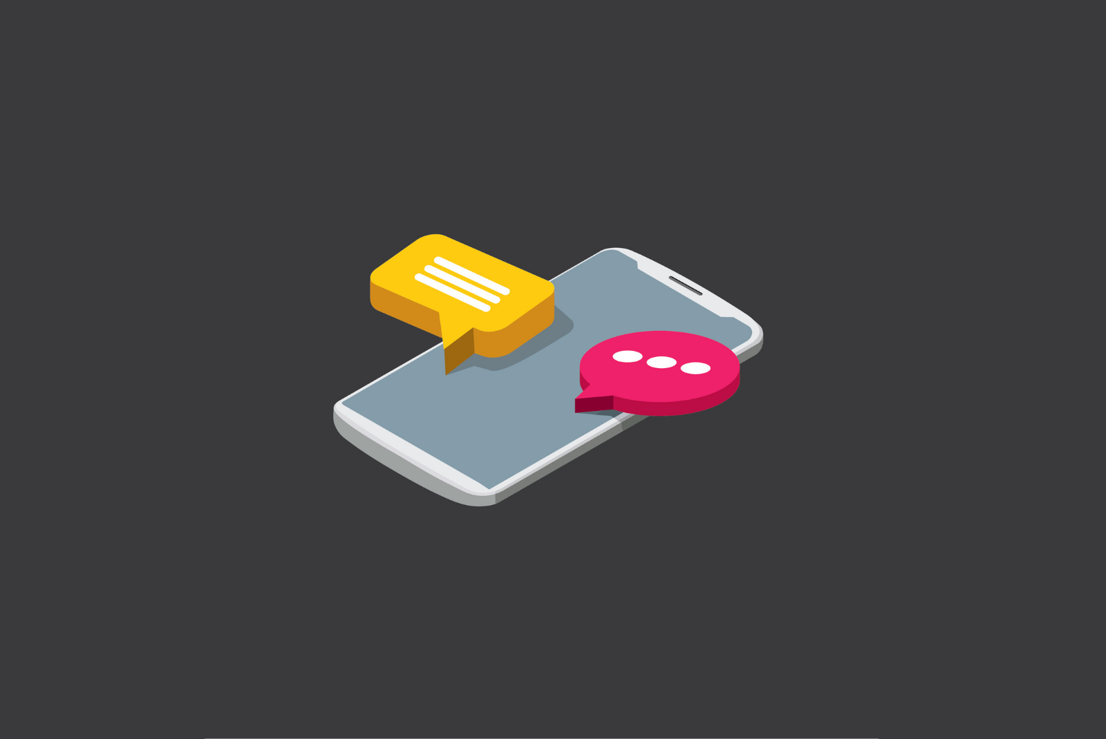
It is just as well that these little animations, so loved and cared for by designers, often go unnoticed. Their function is to perform important tasks with such speed and simplicity that the user neither feels that he’s invested too much effort in any action, nor that time is passing too slowly. A microinteraction is the simple oxygen symbol that breathes life into a website or app design, whilst enabling the user to navigate free of setbacks yet without getting bored.
Defining what is a microinteraction is very easy; however, applying it to a design without corrupting the latter’s basic rules becomes quite a challenge.
As the name suggests, a microinteraction must be small, in the sense of short and simple rather than of space occupied on the screen (although they usually don’t need much of that, either). It entails interaction between user and device, website or app occurring in a clear and straightforward way, yet combining an informative role with a tone of surprise and entertainment.
In short, sometimes the smallest things have to shoulder the biggest responsibilities.
Finding inspiration to come up with new examples of microinteractions is a hard task for the designer, who must combine the basic with the disruptive. The objective is not to fill up all the corners with microinteractions and make the user feel like he’s in a theme park, but to find the most sensitive areas for the user, where a microinteraction can lighten their activity (when this is very tedious) or transmit an extra degree of satisfaction (which will contribute to their desire to repeat its use and to recommend it to third parties).
We hope that the following ten examples of microinteractions can draw attention to elements that you may not yet have noticed (but your users certainly will), since they can instantly improve user experience on a website, app or digital device interface.

Filling in a form
Most people find it boring, to have to put in their username and password in order to enter a platform every time they visit; well it can be even more tedious to fill out a registration form containing many fields.
User identification has now been solved thanks to the automatic filling-in functions on devices, but eventually every new user will have to face a form for the first time round. And in certain types of web pages and apps it is an essential and repetitive process, as in making a payment on an online store.
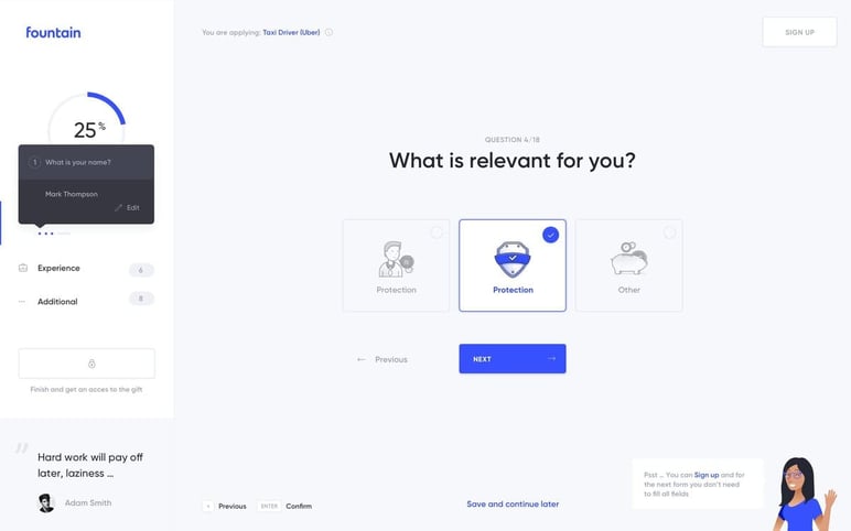
Thanks to microinteractions, the administrative-like moment of filling in a form becomes a fun activity with a psychological reward, such as when you are shown the progress of completed data until reaching 100%. You can also be alerted to unfilled or incomplete fields by a little animation, which is clearer than the dry message "please fill in all the requested information before continuing".
An example: in Basecamp, typical ‘elevator’ music plays while you fill in the access fields, and a bell rings when you have finished. Using humour to help the tedious tasks along, always works.
Action buttons
Add, remove, open, close, save, send ... The command buttons are inevitable in any online or app design, but it’s in your hands to make them more memorable, always taking care that they have a colour, shape, size, texture and animation that’s in harmony with the rest of the design. The 'metamorphoses' or transformations from one form to another are the type of animation most used in command microinteractions and the transition must look as natural as possible.
Pressing the '+' symbol to raise the volume is itself a microinteraction, but what if the button were to subtly alert the user when it reaches a level that may be annoying for others, or harmful to your ears? Users always feel surprised when a commonplace, automated action supplies additional information unexpectedly.
For example, the effect of a bin that opens when a file or selection is deleted, is an idea that is both classic and effective, because at the same time it serves to double-check whether the user really wants to complete that action. All of the common movements of online and digital navigation can be transformed into an interaction that is both pleasant and informative; such as adding a product to the shopping cart or checking how many items are already saved, while a website or app is being browsed.
Browsing a gallery
The gesture of swiping elements on the screen was a real revolution: we all find it more natural and quick to move our finger than to press repeatedly on a surface.
The addition of swiping-effects, streamlines the user experience while various tabs, sections or images in a gallery are being consulted. Taking care of animations and transitions between these types of elements can facilitate a user’s visits while neither requiring him to think, nor requesting a great effort in return.
But this movement is especially useful at key moments when the user wants to save time, quickly complete a process or speedily correct an error. In those moments, sliding a finger is as instinctive as wanting to smudge a misspelled word on a piece of paper. Thus, making use of a microinteraction based on swiping to the left or right is very effective and provides an instantaneous outlet to frustration. And if not, let them tell that to Tinder users.
Confirming a process
The great advantage of the internet is that it never makes us wait. Or that’s what we would wish for, most of the time.
Offering agility is the best scenario that any website or app design can develop, even when some waiting is inevitable. Some essential objectives include: to animate the status or progress bars of any action, like that of uploading or downloading a file, indicating results of searching or streaming, and sending information via a form or a payment gateway.
The user needs to know what is happening at all times. Representing this in a visual way (through colours, shapes, percentages ... our imagination can be limitless) will prevent them from feeling impatient. If there’s an error, they need to know about it immediately. But if everything goes well, they’ll also want to gain that satisfaction as soon as possible. In any scenario, the user wants to know the status of a process in real time, because if they suspect that something has crashed, their immediate response will be to close or refresh, thus losing everything they have done so far ... and maybe never return again.
Some designers make microinteraction into a carnival of masks and special effects, and a simple action such as sending a message gives rise to a letter-devouring mailbox or a UFO that abducts your message before disappearing into the night sky.
Sometimes our imagination must have limits imposed upon it, after all.
A simple animation, with a natural transition of colours (from the red that suggests danger to the typical green of victory), can be much more effective due to its sense of visual neatness. This also depends on the type of average user, their tastes and level of digital knowledge and experience: you have to know whom you are designing for before coming up with the perfect details.
Error alert
A good designer knows that he can't avoid all possible errors, but he takes them in a good mood.
It is common and very effective to use animations and amusing screens to reduce the negative impact caused by an error, a broken link or a slow upload, like the different emoticons that Google Fonts shows whenever it can’t find any font that matches a keyword search .
Microinteractions act like those nurses who are all tenderness and kindness in the dentist’s waiting room: if they are good, they ensure that your heart doesn’t skip a beat when you hear the words "You must repeat the process".
Despite the dizzying pace of progress in recent decades, we shouldn’t forget that the Internet and the digital era are still in their infancy and mistakes are more common than we would like. Alleviating the inevitable pain is the least that a microinteraction can do. The user will be less likely to associate the use of a particular website or app with moments of anxiety or fear; and will be helped through unpleasant events such as having to think of another username that isn’t already registered, repeating a payment by credit card, or reloading an important document.
Reading a tutorial
Here’s a paradox: while we continue to emphasise that users want to surf speedily and without delays, in many cases they are full of doubts or do not know what they are really looking for.
Providing a natural pause to acknowledge that doubt, is rare in this era of immediacy where design is also advancing at bullet speed. Can I know what a process will be like before pressing the dreaded 'Start' button? Can I see how an app works without using it?
Tutorials are a complementary content which is increasingly valued on online platforms; however, a video format cannot always be employed, either due to budget or to the type of product or service that needs to be explained. The typical FAQ sections or previews in app stores can be made much more bearable, visual and didactic with animated tutorials that incorporate microinteractions: sliding between different pages and sections, opening tables of information that may be of interest to the user, enlarging images and linking with other audio-visual materials.
Map navigation
Orientating yourself on a digital map may seem as confusing as looking around you in an unfamiliar city. Although we’re accustomed to the typical animated interactions in apps and map options, such as paths and routes being colour-highlighted and that progress along with us or our vehicle, microinteractions can be put to many more uses.
One of the more obvious functions when using maps is to relate these to other information. For example, to locate places from a list; locate stores or show availability of stock at different points in a geographical area; to animate the weather forecast for different regions or for different times of day in any given location...
Make your maps much more informative and clearer to use, by employing simple commands that immediately activate an animation, which is then easier to interpret than any fixed texts or markers.
Reminders
The alarm clock that chimes every morning from the lock screen of a mobile is a microinteraction, as is the alert that notifies you of the last video uploaded by your favourite YouTuber and enables you to click to view it immediately.
In design, notifications are usually associated only with new content releases or with alerts that are manually programmed by the user. But by thinking about the type of use of each app, you can create valuable and original reminders that facilitate the transition between different sections of an app or between simultaneous tasks.
These microinteractions provide information about background processes or actions that may have been forgotten by the user while he continues his surfing. An upload has completed, a contact is writing a message, your photo has received 200 'likes', a discount coupon applied to a shopping cart is about to expire, a clock that’s counting down in real time until a special date… Even requesting permission to activate notifications and reminders can be a microinteraction.
Easter eggs
The most successful platforms follow the simple rule of knowing their users very well. The most obvious example is the way Netflix customizes the miniatures of each series or film according to the type of content consumed most often by a particular user.
This level can also be reached through microinteractions. Customising the design with details that only certain users recognise and appreciate, can transform the functional experience into a much more memorable and appealing one. The only rule is that these unique details should be a an extra feature not a hindrance, and that they do not become tiring after several uses or visits.
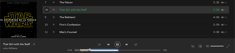
For example, Spotify converts the progress bar of a song from any Star Wars soundtrack into a lightsabre. They also added an 'Other Side' effect when playing music from Stranger Things during the launch of its second season: a perfect example of how some microinteractions can be designed to be temporary or short-lived, as intended to draw attention to a specific content and yet avoid their rapid expiry, as in the world of design anything novel can quickly wear out.
Cancellations
Yes, when taking leave of a user you still have to be memorable. A cancellation or un-subscription doesn’t have to be a final goodbye; and generating a good impression even when the user has decided to leave can do much more for your website or app than keeping a passive user in the portfolio.
Both the farewell messages and the last few questions sent to a user, can be innovative and so prevent them from closing immediately without giving any reasons for their departure. A simple microinteraction brings informality to a negative event and will thus give rise to better participation figures as well as valuable data about the reasons for a cancellation of a purchase, service, newsletter or account.
Do you want to find out if we have applied these good practices and if Sales Layer's online experience uses any of these microinteractions? We challenge you to try to find some... starting with our demo page