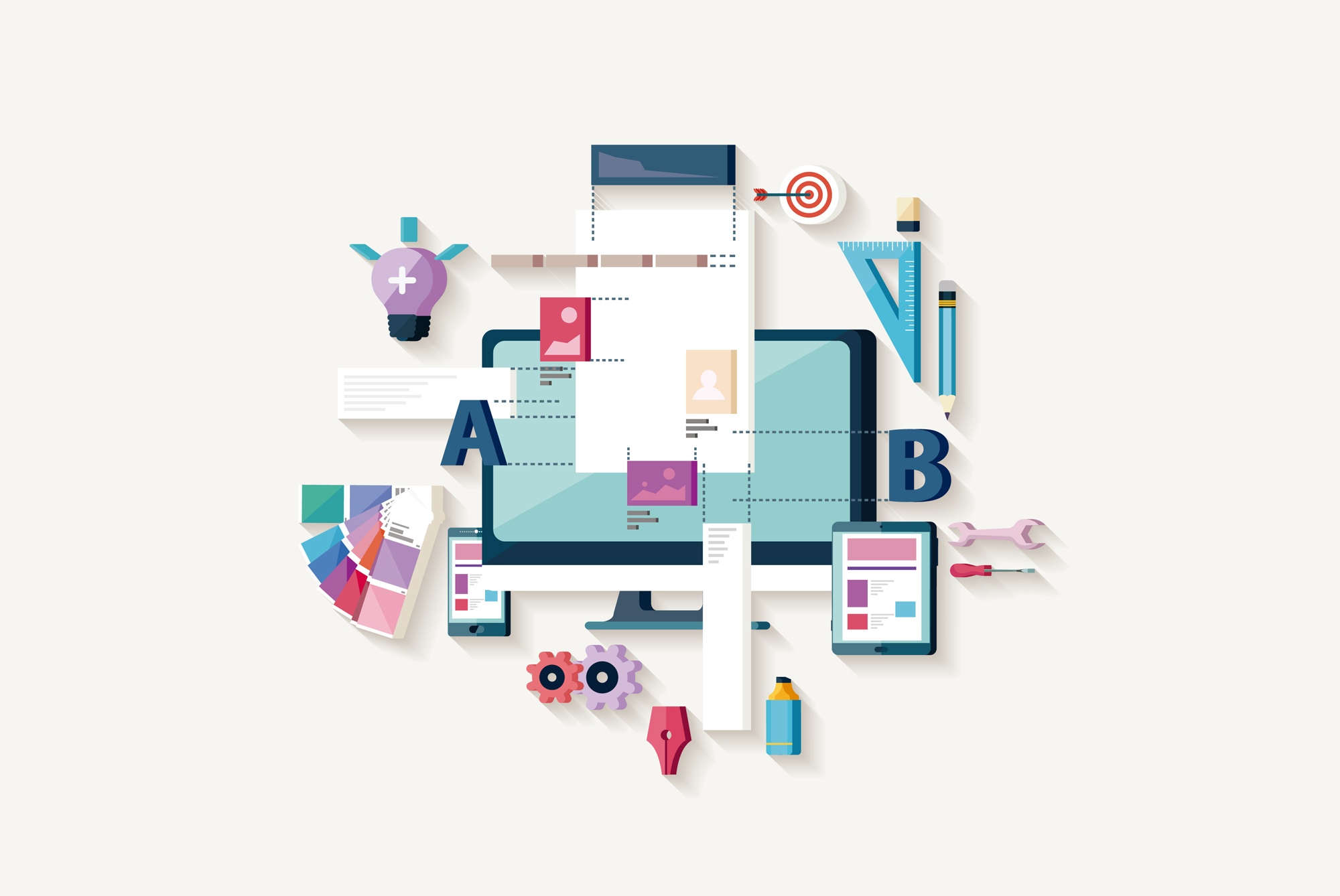
First impressions are everything when it comes to product content. And content must be seen as a strong symbiosis between design and information. These two foundations need each other: the perfect eCommerce website or app should be visually attractive and, at the same time, it must show all the key information in a balanced, precise, up-to-date and error-free way.
This is the magical combination to merge design and content for the perfect eCommerce web design:
Information + Clarity + Fun + Personalization
E-commerce web design should give everything to users, but also offer a bit of interactivity to them, just like the traditional experience of searching and picking up products in a physical store.
A website only has a few seconds to make users feel attracted to your products. We’re talking about very few seconds, maybe 5… or even 3!
What are you going to do with those precious 3 seconds?
- Give them everything! Tips for improving user experience -
Content & Design: The e-commerce twins
The best way to keep the user’s attention from the start is spending a lot of time and effort on your e-commerce website design.
The very first step must be product information, that should be well organized and updated across all your sales channels. For this purpose, marketers can’t work anymore without specialized software such as a DAM system (Digital Asset Management), to keep track of all the visual and text resources, and a PIM system (Product Information Management), to automate the synchronization of product data. (Pssst! At Sales Layer we combine both systems in one single source — discover it here!) When your product content is under control, you could concentrate on your website design.
- PIM and DAM: Which one you need (and how to integrate both of them) -
E-commerce web design key elements
Your first priority as an e-commerce marketer or designer is keeping in mind that customers’ tastes change constantly and that trends aren’t just impulses. A good online store is adapted to each season and evolves as time goes by, adding new design concepts based on analysis of customers behavior. Some basic tips are related to the way our eyes read and analyze any screen, but user experience shouldn’t look too studied and cold, and it must show the emotional value that the brand wants to be linked to.
These are the key tips to achieve a perfect e-commerce website design:
- Clarity and sharpness: The design should be created keeping sight and touch in mind, with focused elements that are easy to interact with on mobile screens.
- Wallpapers: The most effective ones in eCommerce are generally neutral or pure white.
- Key colors: You can follow a corporate palette, but the colors must always be uniform and eye-catching, specially in key areas (like buttons and CTAs).
- Elements structure: The most important content elements for the user should always be located at the top of the page: a name, a highlighted image, the price, the ‘Buy’ button, shipping costs and delivery times.
- Data priorities: You have to separate general descriptions from technical specifications (more suitable as bullet points). It’s also important to highlight different information according to the product: for example, size charts for clothes, assembly instructions for pieces of furniture or video tutorials for beauty products.
- Consistency: Both the product information and the design elements must be similar among different pages and channels — that’s why the synchronization and automation of content management is vital for e-commerce design. Use the same colors, fonts and image formats to avoid visual chaos.
- Photo gallery: Image galleries must have high quality and standardized pics, with the same formats in all product pages. You should offer different browsing options: galleries with thumbnails or bigger images. A new trend consists on integrating the product main photograph with the background — it would look as if the product is floating on the page.
- Interactive elements: Visual support is essential to present and explain products through animations, unique comparisons, an inspiring banner or by giving the user the option to play with the product, such as changing the color of a car, the strap of a watch, the floor of a room...
- Zero distractions: Make sure that pop-up windows with promotions, newsletter subscription or reminders don’t appear too many times on your website, since they can distract users and pop-ups are often seen as spam.
- Secondary buttons: Make options to add the product to a wishlist and share it on social media available. Try to boost your presence on social media with original strategies, such as proposing a specific hashtag for your product.
- Simple reviews: It’s better to let users score your products with stars and brief opinions than with long texts that usually turn to be rants. Your product pages will be more visually pleasant and users will have to be more concise.
- Seasonal design: Take advantage of any occasion to give a boost of personality to your product pages. Christmas, Halloween, Easter, Summer Sales... Any occasion is a unique opportunity to readapt your design, show that you pay attention to detail and launch promotions that encourage visits and purchases.
- Where it all begins: How to design a perfect e-commerce landing page -
Content and design should always go hand in hand in any e-commerce web design. The type of highlighted information and materials may vary according to your product niche, but the fundamental keys shouldn’t be overlooked.
And remember that web design never goes to sleep: don’t be afraid of being bold or trying the latest technical innovations. That’s the best approach if you want to keep your e-commerce design trendy and ready to convince users that are becoming more and more demanding every day.


