

We tend to emphasize the importance of equipping yourself with the right resources that are most adapted to the digital future when it comes to creating your catalogue or online store. But between product information management systems, SKU formats, security certificates and payment gateways, small details can go unnoticed that cause the success or failure of a purchase.
Do you know what convinces a potential buyer to click the “Add to cart” or “Pay” button or not? Yes, quality product information will remain the number one reason and priority for you and your customers. But there is something “decorative” that plays a more important role than it seems.

What is color psychology in web design?
For decades, the impact of color when conveying visual messages to purchasers has been studied. This so-called “color psychology” analyzes how different colors, palettes and tones create neuronal reactions and different associations based on the context, the person and the sociocultural background.
That is, colors seem like merely an esthetic decision. Is a green or yellow background better? Why not use my logo’s chromatic range everywhere? However, it is a design strategy that impacts sales.
Recent university studies indicate that between 62% and 90% of first impressions of a product are based on color. This translates into all digital sales steps: the colors of the photographs, the design of the website, banners, CTAs...
Does color psychology work in ecommerce?
Without a doubt, a studied use of colors can lead to better positioning of products, to more clearly differentiate the brand from the competitors and impact the impressions and emotions of buyers, driving more sales.
Color decisions in product marketing must not be taken lightly or be based on esthetic preferences. The marketing and design department can evaluate the most suitable palette based on the sales intention of each resource. Encourage an impulsive purchase? Convey a sense of urgency and limited stock? Inspire calm and smooth sailing, which allows for catalogue exploration and the addition of more products to the cart?

Since the 70s, a more or less universal meaning for colors has been considered, although this depends on geographic region (color psychology varies in western and eastern countries).
As a general rule, in the West, the color black tends to be associated with negative feelings, white with purity, blue and green with positive feelings and red with strength and alarm.
Therefore, bright colors and reds are directed at impulsive buyers and reactions, while lighter and pastel tones work with more traditional customers or customers willing to evaluate more and spend more. That said, should you use color psychology in web design to the letter?
We are going to guide you in the key colors and tones for ecommerce. Not forgetting to be consistent with your color palette is very important for your positioning, since 80% of people recognize their favorite brands through their typical colors.
How to choose the colors for your online store
Apart from the main and prominent colors, every brand can work with complimentary and analogous colors which enrich the palette and can serve different purposes in marketing a product.
Choosing these colors will depend a lot on if the brand already has a well defined identity and a logo that marks the starting point. Another factor that is usually recommended is the target audience of the products. Nevertheless, more and more of these cliches are starting to break down (like blue tones for men and boys, and pinks for women and girls). According to target age, it is possible that those classic meanings are more or less influential in the impression that the product makes and the design of a digital catalogue.
And, above all, have the purchase experience in mind. The goal is to facilitate the user’s search and purchase, not saturate it with elements, whether textual or visual. A balanced ecommerce design which analyzes what is expected to be found and how your buyers usually search the store will tell you a lot more than the typical meaning of a yellow tone.
White
This is the recommended background in all online stores. White makes it easier to read and identify images and blocks of information. It transmits a feeling of cleanness and clarity, and because of this, is the favorite background in ecommerce web page design and catalogues.
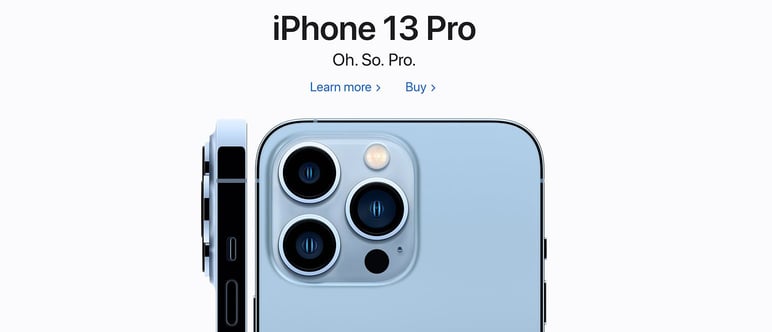
Without a doubt, Apple products have become the most iconic when it comes to presenting their image online. The white backgrounds give the prominence to the products and highlight more direct and attractive slogans.
Black
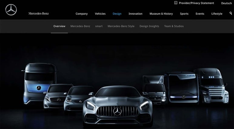
This is an authoritarian and forceful color. The online trends with a design based mainly in black, transmit a professional and serious image, oriented to a demanding or luxury and high quality-loving audience.
Gray
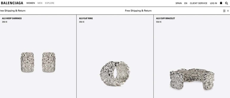
By inspiring balance and apathy, gray is the perfect color for text and elements that should go unnoticed or be easy to read. It has also been a color used a lot in jewelry ecommerce web design, since it transmits elegance and allows the sparkles and colors of the pieces and jewels to stand out.
Red
The color that inspires energy, urgency, and attracts attention in ecommerce. Therefore, it must be used with precaution and in appropriate places and moments, since it can generate both a negative feeling (alarm and worry) and a positive one for the sale (invitation to pay attention and act fast).
Without a doubt, it can be a predominant color in a brand (just think of Coca-Cola). In color psychology for web pages, it is recommended more for key buttons or areas of the page where you want to quickly attract the eye.
Green
It inspires trust, and today, is the key color to associate with messages of sustainability in online product sales. Not only in wellness and heath brands, like pharmacy, but in any part of your ecommerce dedicated to informing the commitment of your brand and the production and sales of your products to the environment, a more and more important aspect for buyers.
Brown, yellow and orange

These are colors that are associated with warmth, happiness and curiosity, therefore they are usually used in the baby and children’s product sector, but also in sports and pet products. In excess, they can bother the eye or transmit feelings of stress, so it’s advisable to not abuse them too much and limit them to very specific resources.
Blue
The color of balance and tranquility. These palettes are usually associated with the technology sector and electronic, computer and gadget sales.
Pink and violet
These are tones that seem reserved for the cosmetic industry, and especially pinks have had a long history associated with a children’s audience. However, they are colors that transmit inspiration, elegance and care, and manage to give an image of seriousness and good taste in the presentation of ecommerce products, above all in backgrounds and more pastel or aggressive tones, based on the brand’s ideal audience.
Now that you know color psychology applied to ecommerce web design a little better, do you think your brand applies it following a style and intention?
Remember that with a PIM system you can have all of your catalogue resources under control, like product photography and logos, and analyze that they are updated to the latest version in your sales channels.
Try it for free with Sales Layer and discover the power of the color green: a system that improves the quality of your ecommerce content and the satisfaction of your buyers will make you more reliable and sustainable.