
So begins many a detective story: somebody new arrives at a party and the other guests seem to be uncomfortable around them.
There’s something unpleasant about them that nobody can figure out. Then, enter the trusty detective: our protagonist has a much sharper and well-trained eye than the common mortal and knows how to determine what arouses such suspicion.
That tiny, simple detail. The guest had wanted to dazzle everyone with an orchid on their lapel which, sadly, let off a subtle, nauseating smell.

In online design, a lot of the time we run into this type of guest who tires us out or makes us nervous. We navigate with agility and we don’t have time to stop and be a detective. But there was a detail in the design that caused our experience to fail; and so we hop off to some other place.
This is where the silent detectives who know everything come into action: the microinteractions that make the user experience an unforgettable, natural event with no nasty surprises.
Table of contents
- They are everywhere you look: What are microinteractions?
- How are microinteractions changing the face of UX?
- Principles of microinteractions: The best practices are in the details
They are everywhere you look: What are microinteractions?
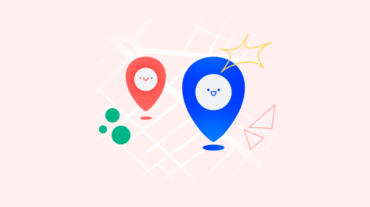
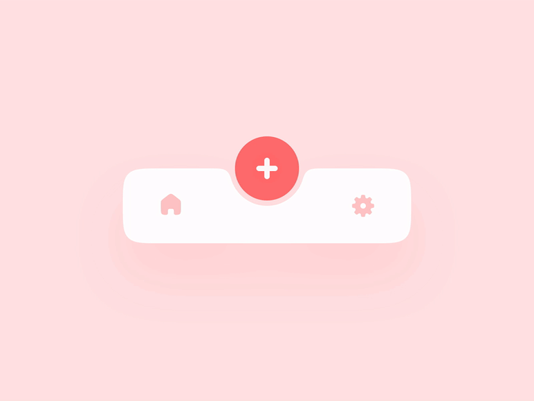
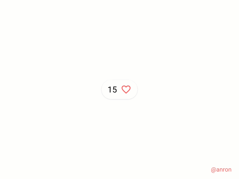
Put simply, microinteractions are small animations in which design and the user interact, whether it be on a web page, mobile app, software interface or device. It is used to inform the user about an action used to improve their experience, such as read receipts in a chat conversation, the ‘Like’ button on social media, the loading progress bar of a video, a product’s star rating…
Microinteractions are not just great instruments to start an action, but they also keep the user informed of the progress of a request. The old panic of a white (or black) screen and not knowing if an action has succeeded or failed is resolved through microinteractions which constantly indicate what is happening with each click.
How quickly is the large file being sent? Is the PayPal payment being transmitted to the online shop? Has my password been updated? Is the size of this podcast really made smaller with a bluetooth speaker? All is revealed with a microinteraction.
The usefulness of these small animations is based in reducing information to a minimalist format, which makes the user’s waiting time more bearable, especially when response rates for each action are requested more and more quickly.
But microintentions saturate the entire interface design and are able to mirror more actions and offer a uniform experience in every tiny detail, as we will see next.
- Complete tasks more quickly
- Interact with individual elements
- Change application options (basic on/off)
- Create and receive brief information
- Manage in progress processes
- Suggest related recommendations
- Improve navigation or inquiry
- Connect multiple devices

How are microinteractions changing the face of UX?
At this point, recognizing that good design means more than beautiful design should be obvious to developers. But it seems not all websites and mobile applications have digested this truth and, a lot of the time, continue to offer confused or incomplete user experiences hidden behind colours and attractive images.
The best microinteractions are those that go unseen, which indicates two things. One, that the design is so good that the user is able to recognize its functionality and usefulness straight away without an instruction manual or much more than a brief explanation. And more important still, the assimilation period of these microinteractions is infinite, in the way that they immediately are of use to the user experience and they improve satisfaction and therefore loyalty and trust in the app, website, software or device.
The weight of the word ‘revolution’ may distract from what it really is. What is revolutionary about microinteractions is, above all, the heightened level of effectiveness by means of simplicity.
It is not about a complex design, or a striking animation that begins to get old after using it three times, or trying to be absurdly different to the competition.
The “I’m feeling lucky” option in Google’s search bar and the “Thumbs up” pioneered by Facebook are some of the most famous (and simplest) microinteractions.
The best microinteraction design remains based on the basic rules. They should be constructed from previously acquired knowledge and be part of online behaviour. For example, how ‘X’ signifies ‘Leave’ or ‘Close”, how the colour red is associated with ‘Cancel’ and green with ‘Confirm’.
The microinteraction revolution based on elements known by the user in advance even reaches the physical experience. While the designer Ken Kocienda was working on the iPad interface for Apple, he looked for natural gestures to transfer to the digital experience. For example, closing an app to go back to the device’s home screen would be a gesture very similar to ‘scrunching’ a piece of paper.
“What exactly is a 'scrunch'? I used the word to describe the gesture where you move your fingers on the screen in a grasping motion, as if the app you were using was a piece of paper and you were crumbling it up to throw it into a wastebasket.”
A microinteraction can be applied to any type of action necessary for the user, but always comes from the same starting point: What is natural? What other acquired behaviours can we incorporate to the experience to annul the learning stage? I don’t like it or I don’t want it: I make a ball of paper and I throw it away. Microinteractions reflect the way we used to behave before the world was digital in order to make the transition from offline to online more subtle.
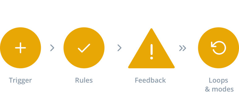
Dan Safter, Product Design Leader and author of the book Microinteractions: Designing with Details, describes four phases when it comes to defining a microinteraction.
1. Trigger: The motive behind the microinteraction.
2. Rules: They determine what happens once a microinteraction is initiated.
3. Feedback: The response sent by the microinteraction to the user.
4. Loops and Modes: The loop determines the microinteraction length, and the mode determines if that repeats or changes over time.
Principles of microinteractions: The devil is in the details
When it comes to designing a microinteraction, it is a good idea to bear in mind a few key things or principles which guarantee the most natural integration into global design:
- Use natural and human language: Robotic texts repel a lot of users, and even a couple of badly used words can cause a lot of confusion. Use vocabulary familiar to your users and easy to understand language.
- Design with the user in mind: Deciding where and how to include a microinteraction must always be based on data about the user, contact or platform. This information is fundamental in creating microinteractions and adapting the product to them instead of imitating microinteractions that are not responding to the specific needs of that experience.
- Extract useful data: Show the user information without them needing to access the application or website and save effort online. For example, a company’s email or telephone number from a business directory or search engine or the temperature of a city in a weather app.
- Use long loops: Think how your product adapts over time. What will it be like when it is run the next day? And the tenth time? And the thousandth? Any microinteraction must be able to be repeated again and again without becoming old or cliché.
- A microinteraction is only one action: Each microinteraction should respond to one single request or question. Do not link different animations and actions in the same loop because the user must have the freedom to complete tasks one by one in the order they indicate and prefer.

Brief guide of good practices for designing microinteractions
Simplicity rules
Microinteractions should go undetected. Nowadays there is nothing more normal and automatic than tapping the flag on Instagram to save a photograph, the basket icon for adding a product to your shopping cart, or the envelope symbol for writing a new email.
Microinteractions shouldn’t need thinking time, they should run instantly. They should be simple, easy to record and perform actions can be easily incorporated into human behavior.
Misusing animations can make the eyes tired and overwhelm the user. The littlest flick, sparkle, flash or hop can evoke a positive initial surprised reaction, but ensure these elements always have a meaning and are not just for decoration. For example, if a file download is being slowed down or stopped, a small animated detail such as a car skidding to a halt can be both entertaining and informative.
The user’s feelings come first
And we do not mean looking after their emotional wellbeing (though that would be a plus). Emotional design refers to incorporating pleasant elements to make a more memorable experience for the user.
The user likes to feel they are being informed at all times and that the interface is preempting their needs. Microinteractions save the user time and effort in searching data and confirmations, which increases the chances of them using the interface again and recommending it to others.
Surprise the user
The day Twitter changed the way they highlight a favourite tweet to a heart icon instead of a star, the uproar of the online community was split in two: some did not like the new heart system, others argued it was a lousy innovation for a multi-million dollar company.
Sometimes a simple detail can involve great advantages unseen by the user, other times they are superficial changes with little creativity. It is necessary to frequently renovate microinteractions as new things become familiar and boring almost instantly; but these changes must be justified.
The lesson here is that surprising the user is more complicated every time, as you need to find a balance between what is functional, predictable and innovative. Using hearts to highlight elements is not a surprise in any design, in the same way you always have to stay one step ahead of the user without losing sight of their actual needs.
Microinteractions with a purpose
An app full of icons, each one with a different objective that is unclear at first glance, would end up causing more stress than helping the user through fast and simple clicks. Each microinteraction or animation has to be in keeping with the general design.
No online experience should be crammed with microinteractions just because they seem useful: they must only be used when they have an objective obvious to the user and when they make the user’s navigation or experience easier and do not add new jobs.
Microinteractions have value for the user, but also for you: if they are well designed, users are more inclined to participate, interact and share the contents of your interface.
Final thoughts
Microinteractions are part of a good website or app design because they combine the two big goals of any online experience: functionality and entertainment. Offering useful information at the same time as streamlining navigation is the reward any user hopes to receive in exchange for putting time into downloading or opening an app either for fun or out of necessity.
Microinteractions are little gestures which make life online easier and care about the user’s feelings. Because the secret to happiness and loyalty, even on the internet, is too in the details.