
The whole of your ecommerce website is a test of your customers' patience and satisfaction, and on an ongoing basis. The bar is set so high because we know that on any of the pages of an online store displaying key content and product information, either purchase or abandonment can occur.
Even if you manage to resolve those shoppers’ concerns, a difficult final sprint still remains: the payment process.
Arriving at the checkout page seems to be the last step, but it's far from being an outright conquest for you. In fact, the estimated average number of shopping cart abandonments online is 69.57%.
More than 6 out of 10 visitors to your online store never complete a purchase. And don't imagine they're saving it for later: chances are they'll never come back.
→ Also of interest: Tips for avoiding cart abandonment in ecommerce
While you can always try ways of recovering those lost buyers, it's better to be proactive and take steps to improve all those sources of failure that you're (perhaps unwittingly) applying in your checkout process.
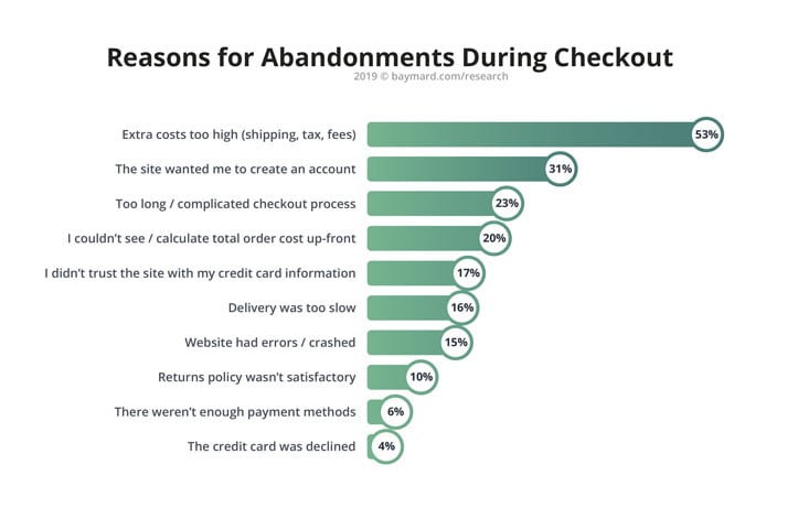
According to a study by the Baymard Institute, any ecommerce business can increase its conversions by up to 35.26% by improving the design of its payment process.
Are you ready to recognize your mistakes and redesign yours?
Here we list the mistakes (and how to avoid them!) in ecommerce checkouts, that may make you lose customers.
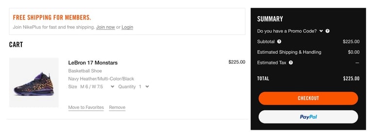
Too many steps, fields and windows
Nowadays, browsing an online store is usually quite time-consuming. Unless the customer had made a bee-line for a particular product, they’ll no doubt have had to navigate through a maze of categories, menus and various product sheets before deciding what to buy.
Imagine having spent half an hour in the supermarket pushing your shopping trolley and then having to spend another half hour standing in the checkout queue.
The big advantage of online shopping is speed. That is why your checkout must be streamlined, simple and user-friendly. In fact, shoppers prefer a process that is separated into blocks, even if it involves a number of steps.
Don't use an endless window or go overboard and create ten steps that could easily be boiled down to four.
Use simple forms, where the fields for customer details are clearly differentiated from the tick-boxes.
Tip: Display a progress bar or indicator at your checkout, so that the user can keep informed at a glance about the whole process. Also, it’ll offer psychological satisfaction, as when making progress in a video game.
→ Also of interest: Heat maps to help you understand your checkout page
Requirement to create an account
They say everyone wants to feel like they belong to a club, but you can be fairly sure it's not yours.
Insisting the customer should create an account, or should enter their registration data every time they want to make a purchase online, is one of the biggest mistakes in ecommerce.
For two reasons: time and privacy.
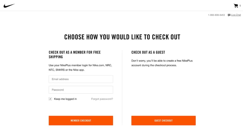
Always provide an option for payment as a guest or without registration. You might find this a tricky decision to make from a marketing point of view, since you'll be losing out on a customer's email address. But what would you prefer, an email or a money deposit?
Tip: Mark the option for checkout without registration as default, so that the customer login box appears at a smaller size. If any of your buyers are already registered, they will know to click on that option.
The need to type EVERYTHING in
It would be alarming if an ecommerce checkout recognized a user's first and last names automatically.
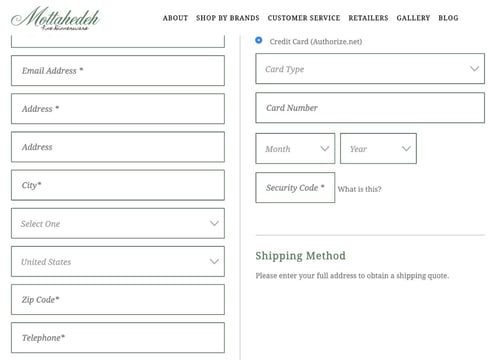
However, there are other requirements for information that you can minimize to avoid your buyers having to type in too much. For example, use a drop-down list of mailing address suggestions with the Google Maps API, which makes it easier for the user to select one instead of typing it in by hand (which might lead to errors creeping in).
Other information that you can provide to the buyer, and in relation to the previous section, are the available methods of purchase. Where a registered user is concerned, you can give the option of saving their credit card data so that they don’t have to enter them afresh every time.
Tip: Activate the option of correction suggestions in your form fields, to prevent the customer inadvertently mistyping any important information.
→ Read more: Micro-interactions that improve the shopping experience
Unexpected shipping costs
One of the biggest frustrations for online shoppers is not knowing in advance how much the shipping costs will be.
It’s important you include a table of fixed costs both in the FAQ section and in each product sheet, or a calculator if your costs vary according to the type of shipment.
Remember too, to adapt the currency to each country or give the user the option to change it at any time. Viewing a website only in sterling, for example, and having to rely on Google to calculate the exchange rate is commercial suicide.
According to WorldPay, the total purchase cost being too high is the reason for abandonment in 32% of cases. Think of it like this: your customer will have reached the checkout satisfied with the price of the product, or she would not have added it to her cart; yet the cost of shipping is going to determine the outcome. It's maybe fine to be paying 25 USD for a piece of sports equipment, but what if it costs her another 25 USD to receive it from Canada?
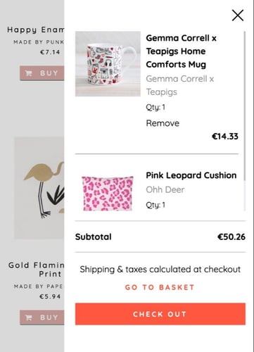
Tip: Include a drop-down or pop-up summary of the current basket on each page of your website, so that the user doesn’t have to go to the checkout tab for this. It should display all the basic information: price per product, shipping cost and estimated total.
Hidden returns policy
This may sound pessimistic, but most online shoppers wish to view your returns policy before purchasing. A lot of online purchases result in exchanges or returns because it’s not yet as accurate a method of shopping as in traditional, physical stores.
According to UPS, only 53% of users are satisfied with the type of online returns provided in ecommerce, and 58% of shoppers expect returns and exchanges to be free.
Whether you can afford that policy or need to charge a fee, the main thing is that you make it abundantly clear at the checkout stage, to avoid surprises for the customer later on.
Tip: Don't forget to include, at checkout, any further information about extra costs, such as VAT breakdown, notice of possible customs fees, or shipping cost increase per unit weight of the package.
→ Which is best? PayPal or Stripe: which of these payment gateways should you choose for your store?
Blocked shopping cart
Let’s suppose a customer has just realized that he (or she) won't be home on the delivery date and needs to change the address. Or he’s noticed that he has mistakenly added two belts to the basket instead of one.
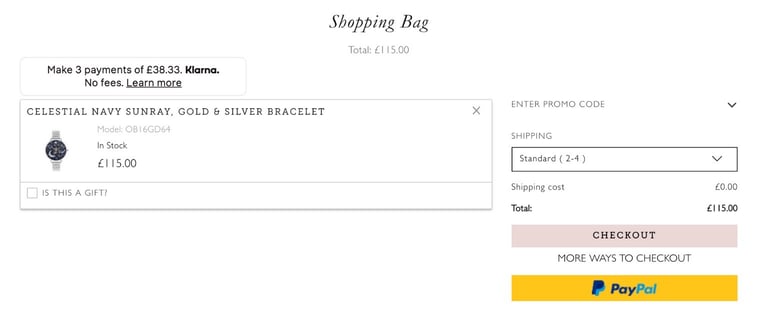
Whatever the case, try to give your users the freedom to edit and review their shopping cart at checkout. And thus avoiding the nightmare scenario: where going back to the previous step would mean filling in all the fields again, from scratch.
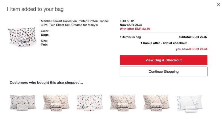
Tip: Take advantage of your checkout to suggest accessories or complements of the products in the basket, that the buyer may have overlooked.
→ You might also try: The checkout in ecommerce is a great opportunity for cross-selling
A limited selection of payment methods
Payments made only with Visa or MasterCard have become history.
Every online customer is a world in themselves and you should include all possible payment alternatives. Of course credit cards are still widely used, but also payment gateways such as PayPal, Stripe, Apple Pay, Google Pay, or even through an Amazon account.
Adding more payment methods to an online store may mean more technical work and fees for you, but also means gaining more customers who won't drop out when their usual, preferred payment method is not available.
Tip: Some users still have problems filling in their payment details. Make it easier with micro-interactions, such as a virtual credit card that is easier to complete, because it’s identical to the one the customer is holding.
→ Keep up to date: The most popular payment methods in ecommerce
Absence of security certificates
At the end of the day, a checkout is not only a transaction of money, but also of privacy.
Online shoppers need to be 100% sure that your online store is trustworthy and has the correct permits, certificates and highest security measures to prevent any fraud or data theft.
Make sure you include in your checkout, especially where bank or payment details are entered, the seal of the security system you’re using in your ecommerce, such as VeriSign, Norton Secured, Verified by Visa, MasterCard SecureCode, or McAfee Secure.
Tip: Information about your security certificates should be available throughout your web browser. Include a permanent link with all the technical and legal information for your users.
Customer service chat unavailable
What happens if the payment screen hangs up? Why does the shipping address field continually fail, if the address is correct?
Many things can still go wrong at checkout, either due to technical failure or a mistake on the part of the user. At that critical moment, it’s vital the shopper can turn to something more effective than the FAQ section.
A live-chat box or tab is useful throughout the web experience but especially so during the checkout process. It’s worth including one and making it highly visible, as well as providing further options for contact such as a phone number, on that same screen.
Tip: If you can't afford a 24/7 service, you could try out the latest machine learning and AI technology as applied to conversational commerce. A chatbot can be programmed to resolve basic user concerns and indicate when a human employee will become available again.
→ Related content: The importance of using chatbots on your website
Conclusion
The purchase checkout is a critical moment for online conversions in ecommerce and involves gaining or losing a loyal customer. It should be an easy, user-friendly and streamlined process that is part of a flawless shopping experience.
Other errors occurring in the payment window of your online store may be due to the general operation of your website or to specific technical problems, so it’s also advisable to perform general speed and performance checks.
Winning customers always stems from providing the quality they’d expect: flexible surfing, complete product data and a fast and reliable checkout. We’ll help you to get your buyers through to the last step successfully, well informed about your products and arriving from any channel: try it free for 30 days.




.png?width=520&name=Blog%20Partner%20(3).png)

