
It costs a lot to get quality visitors to your online store, you know that, right? Redirecting traffic to your market channel can be relatively simple; there are many ways to do it, but to achieve traffic composed mostly of people interested in your product and with an intention to buy it, that's another story.
And the biggest mistake one can make is that these people 'ready' to 'convert' arrive at the online shop with the intention to buy but do not do it because they detect something that does not convinces them, a fact that reduces their trust in your site. And then the last click comes and instead of being the ‘buy’ button it’s the 'exit' one, thus ending what could have been a sure sale.
What could have gone wrong? There are many aspects to consider in an online shop and that makes or breaks the users’ trust. Most of these aspects are pure logic, but despite being obvious, too often these aspects are overlooked.
Here we present eight features that your online business should not lack and that will help you earn your customers’ confidence.
# 1. Be polite, introduce yourself
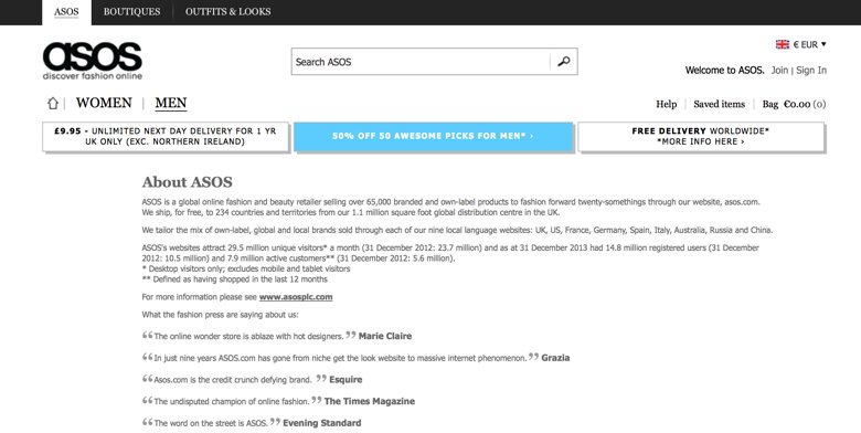
Somewhere on your online shopping portal, there should be a ‘who we are’ section. If you prefer a low profile, you can do as most people do: put a link at the bottom of the page. Put it where you want and how you want it, but tell the world what is the name of your brand, the company name, the address, a contact number, the CIF, the entry in the commercial register data... It's the basics; moreover it’s a legal requirement.
# 2. In exchange, asks just enough about your customers
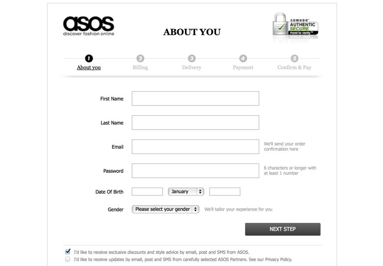
Check the form that your customers must complete in order to make a purchase on your site. It does not really need to contain more than their name, shipping address and contact email, perhaps being generous, a telephone number to contact in case of any incidence. That's it. Having to fill out long forms filled of asterisks leads to rejection. Furthermore, the sensitivity given to personal data is 'in crescendo', therefore you must also inform on privacy policy, on the use you're going to make of the provided data; moreover you should offer the possibility to modify, cancel or delete their account.
# 3. Purchase conditions have to be very clear
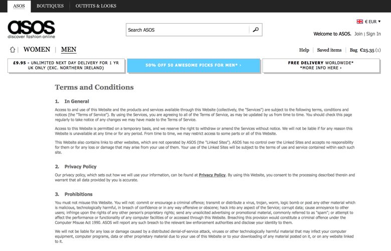
You must clarify any doubts that someone thinking about buying a product online might have. How long will it take to receive their order; what happens if they’re not completely satisfied or the product arrives defective and they decide to return it; if there’s any customer service to contact in case of any questions on guarantees, methods of payment, etc ... and something very important: the shipping costs! It is indispensable that these costs appear at the beginning of the transaction so the customers don’t have to go through most of the steps of the transaction to find out the total cost of their order.
# 4. Tell them everything about the product
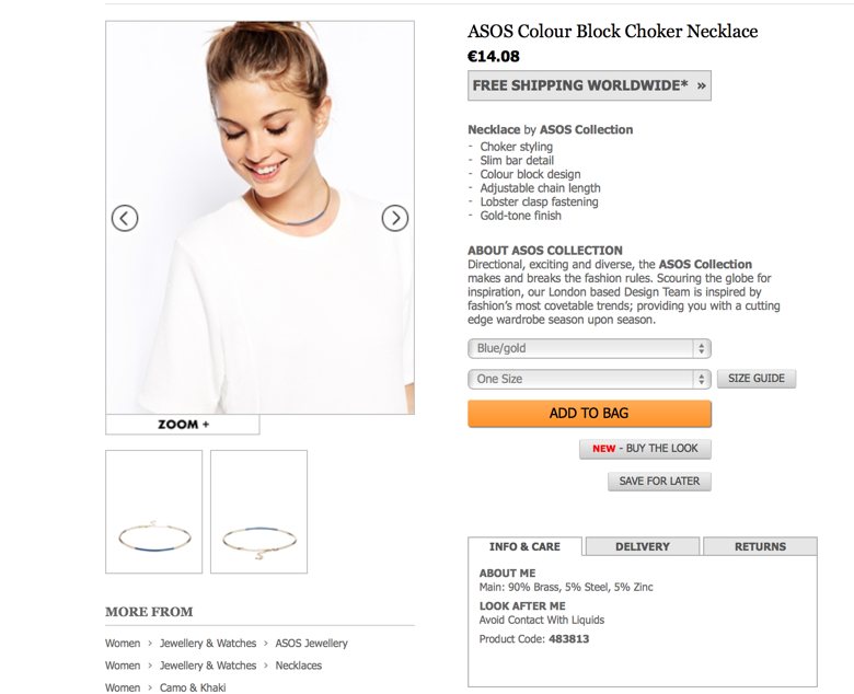
There’s so much to say on how to explain to the user the benefits of our products, that this topic deserves a full post but we’ll put in a nutshell the basics and most important about it for now.
You must invest time in preparing optimal product files with the features of what you intend to sell (uses, measurements, benefits ...), information that obviously differs depending on the type of product. Our recommendation is to be descriptive but also inspiring, talking about the usability of the product and the benefits it will bring to the customer.
And of course do not forget to add a quality picture that can be expanded and for what is worth, adds multiple views.
If to all this, you can add videos and user comments, you’ll be as close as it gets to perfection.
Having your product files well updated across all your online channels will possibly be one of the most laborious and repetitive tasks you’ll have to do. If you've already realized that this work is the one that absorbs most time and resources from your marketing department, remember that in Sales Layer we are dedicated to simplify, rationalize and improve this process. If you want further information, this is the gateway to a new dimension in managing your market places.
# 5. Diversity and security at checkout time
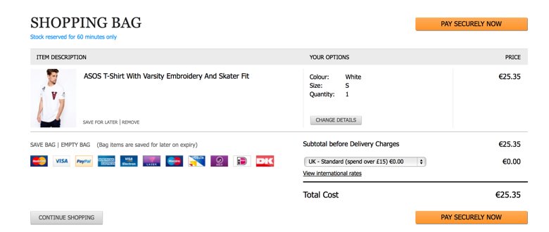
The checkout time is the most critical of all, so we must make it very easy for the user. Safety is the primary value so on your platform, provide a gateway for a secure payment along with various other options: PayPal, credit card and debit card, bank transfer, cash on delivery, Google Wallet, Amazon Payments... Do not think only in your benefit and your own convenience, put yourself in the customers’ shoes; is the best you can it what will bring you more benefits.
# 6. Open communication channels with your customer
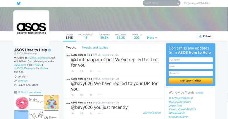
If for any doubt or inquiry the users need to contact you, show them the way. There are many communication channels that you can put at their disposal, from the more immediate, like an online chat or a phone number (not premium rate) to the email or contact form. If you opt for less immediate methods, inform them on the maximum timeframe in which you will answer their inquiry and, above all, stick to it. Of course, do not forget about a constant and careful communication through social media where you must answer all comments, the good ones and especially the most critical ones.
# 7. It’s in the details!

These are details but they are noticeable and many consumer associations are going to great lengths to make these little details appealing for users. For example, making sure that the URL contains an‘s’ after the ‘http’ which means security, i.e. 'https' – one letter that certifies that we are in a safe place. The little padlock icon on the website’s address bar also conveys this security.
Making your online store a safe place can save you a lot of trouble.
# 8. Carry out your commitments
The best user trust you can have is the one that you earn with your actions. If someone trusts you, your website and your product and at any point in the relationship, you disappoint him/her, forget it, it will be very difficult to regain their trust.
Meet deadlines, meet the product guarantees, comply with the return and refund policy and, above all, take the after-sales care very seriously.
A timely refund can make the difference in whether the customer will buy from you again or he will be positively sure he’ll never come to your online store again.
[stag_divider style="dashed"]
These are our 8 basics to gain the trust of a client online.
Do you have them implemented on your web page? Would you add any more?



.png?width=520&name=Blog%20Partner%20(3).png)

