

Recently, our company marked a decade of growth, during which we underwent a remarkable transformation, evolving from a small startup to a well-established enterprise. However, this evolution wasn't accurately reflected in our brand, prompting us to embark on a significant change that would convey the maturity and distinctiveness we've achieved.
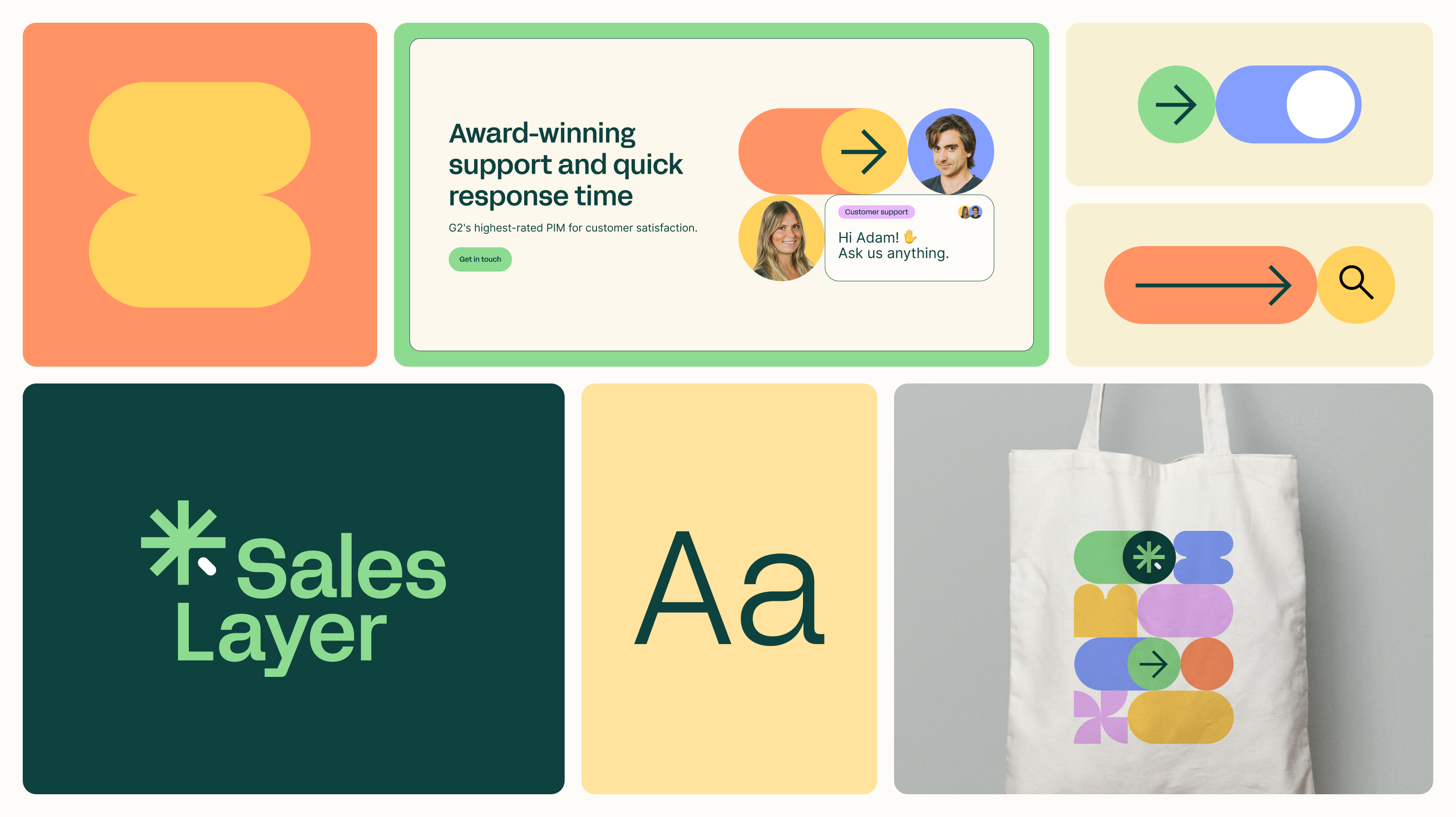
A glimpse of our new logo
Our primary goal was to create a recognizable brand; the current symbol lacked recognition, so we needed something more compact and memorable, focused on enhancing the concept of centralization: 'Single source of truth.'
To achieve this, we grounded our new symbol in basic and recognizable shapes, starting with the asterisk, which evokes centralization. Through modifications, we added personality and prominence to the symbol, aligning it with our brand values of centralization, connectivity, and quality.
![]()
A vibrant color palette
One of the most powerful assets a brand can possess is its choice of color. Simultaneously, color represents one of the most challenging associations to establish for a brand.
When executed effectively, a quick glance at a specific color can instantly evoke a universe of brand-related associations.
Since our inception, green has been an iconic color for Sales Layer, so it was something we wanted to maintain but with a new focus. We undertook the task of refining the original green tone and expanding it with a darker shade. These combined green tones create a compelling contrast for enhanced legibility. To enrich the identity, we expanded the primary color palette with four additional tones that complement each other. Thanks to excellent contrast and mutual combination, we can broaden the graphical identity of Sales Layer.
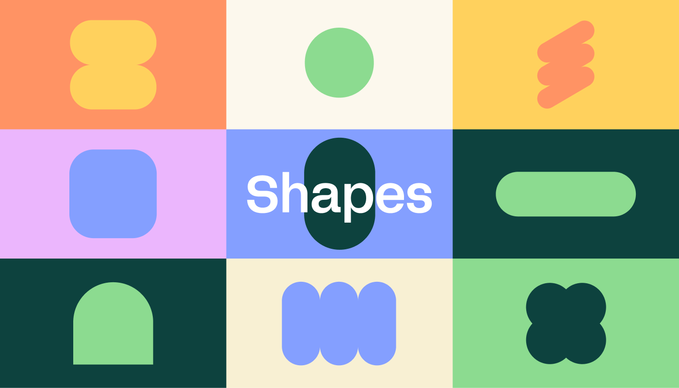
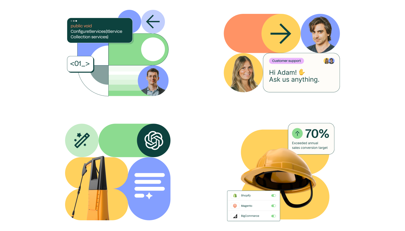
Endless possibilities
Sales Layer is a modular and adaptable tool, and we wanted to reflect this in our brand. Starting from one side of our symbol, we created a system of shapes that, combined in various ways, give rise to patterns that will be used throughout our brand. The combination of these forms not only enables the creation of patterns but also the generation of attractive illustrations that can seamlessly integrate with images.
The key is consistency
Consistency is essential to build a great brand, establishing clear rules on when, where, and why to use specific colors and how they should be combined. Everything we integrate into our identity makes sense as part of a global system.
We are excited for you to experience our new brand on saleslayer.com and observe these elements in our product and social media.
Welcome to the new Sales Layer!


.png?width=520&name=3200x1796%20(3).png)
